You’re strolling through the aisles of books in your favorite book store. All you can see are the spines of thousands of books with titles that mean little to nothing to you yet. You stop. One book stands out to you.
Why?
Publishers and book marketers put much thought and effort into what will make covers stand out to potential readers while also communicating the nature of the book. The base of this design relies on color choice.
A variety of studies have looked at what certain colors communicate to people, and books take full advantage of this information when designing covers. Based on your personal preferences, the color of covers might be the reason why you pick certain books.
Here is some insight into what colors can communicate to you and how that translates to blind book choices according to marketing and branding studies into color psychology.
Red
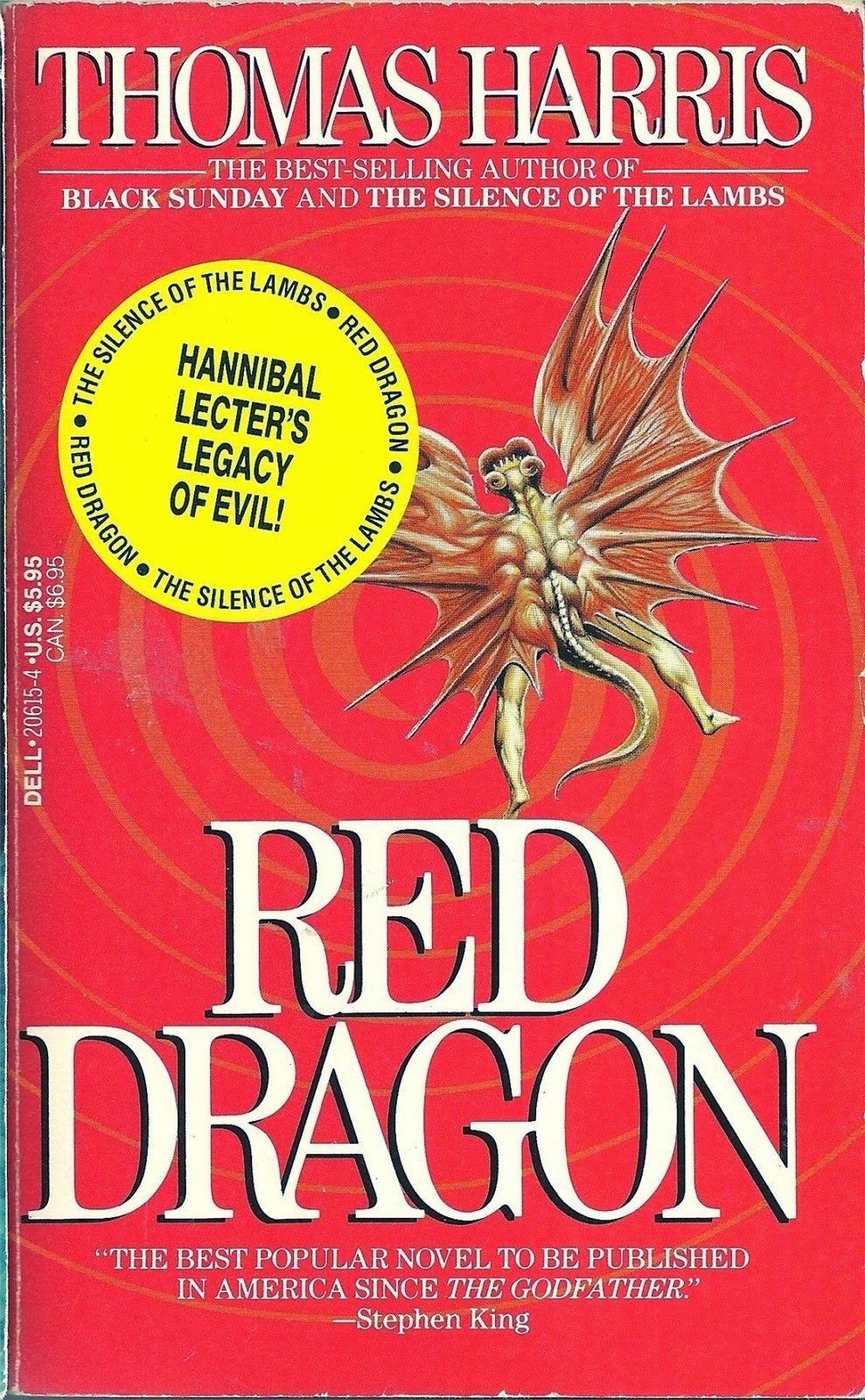
A bold color, red conveys excitement, passion, fear, and aggression. Because of all the energy associated with the color, it makes sense that it is often a color chosen to be featured for thriller or horror novels. If you’re looking for this type of novel, chances are your eye will be drawn to the red cover.
Source: Amazon
Blue
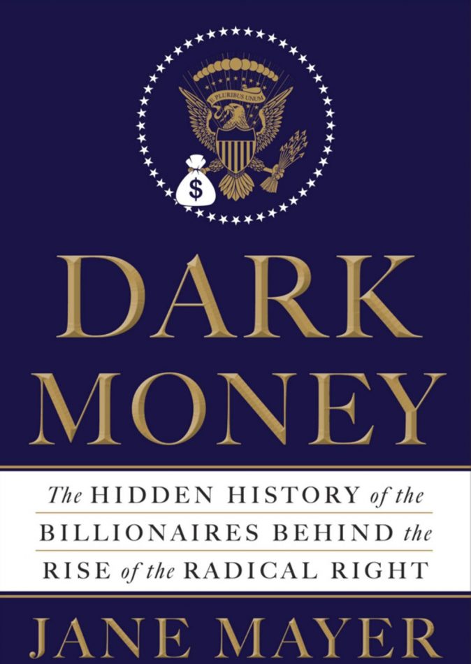
This is the color of trust and mental engagement. You’ll recognize it from many political non-fiction books as well as thought provoking novels. When you see this color cover, you know you’re in for a mental journey that will keep you thinking during and after reading the book.
Source: Amazon
Yellow
Yellow is known to be used to show optimism, cheerfulness, and joy. However, because of this known use, book covers have also used the color for horror and thriller novels to catch readers off guard. This is one color where you’ll want to make sure to read the dust jacket to make sure you know what kind of book you’re about to read.
Green
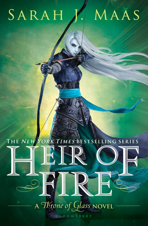
Usually associated with nature, green is a color often used for fantasy or supernatural books. The color also evokes a feeling of balance and growth that go along with emotional and personal novels.
Source: Amazon
Black
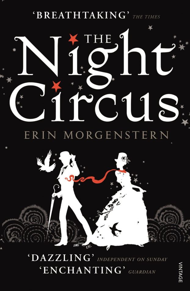
Without a doubt, black is seen as the most serious color. This translates to mystery, sophistication, and death. This is one of the most common colors for book covers because it is also a neutral that helps play off other colors. For black, look for what colors play off it or other design elements, like typography, to catch your eye.
Source: Amazon
White
White is the epitome of purity, innocence, and simplicity. Books with white covers will often catch your attention because of their minimalism. You’ll be intrigued by the small graphic clues you’re given and want to read to discover what you don’t see on the cover.

Source: Amazon
While design and color choice can influence your book decisions, remember not to judge a book by it’s cover – enjoy the whole rainbow of books on the shelf.
YouTube Channel: polandbananasBOOKS
Featured image via Flickr
h/t coschedule
